TrueBlue
Stronger Together
Conference branding, an annual report, and a benefits guide, across several years with one client.
What I did
- Event branding
- Environmental
TrueBlue is a workforce solutions company, connecting people and work. The work spans several years and several kinds of project — the branding for their national sales conference, the annual report that explained a changing business to investors, and the guide that rolled out a new wellness programme to their workforce.
In the room
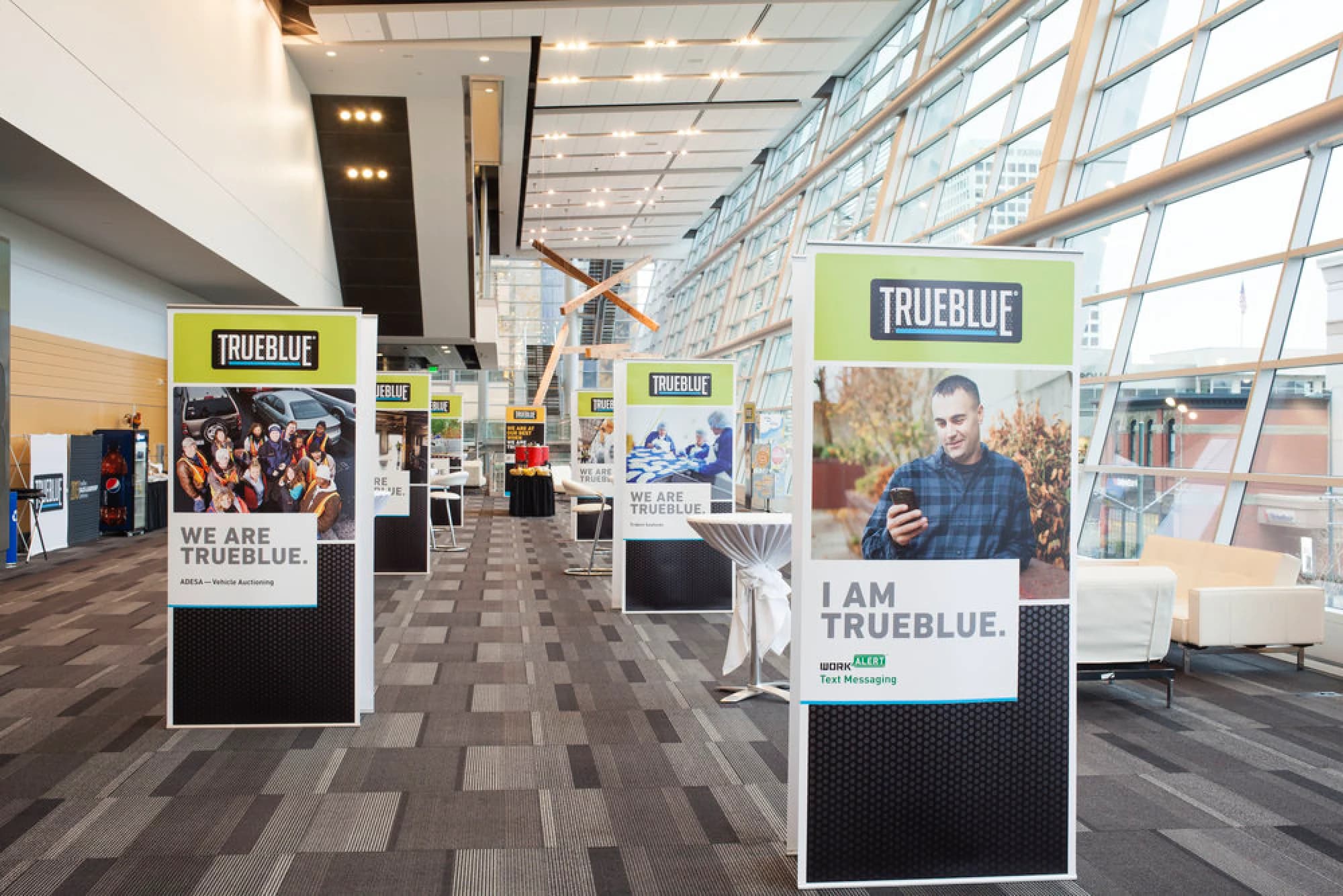
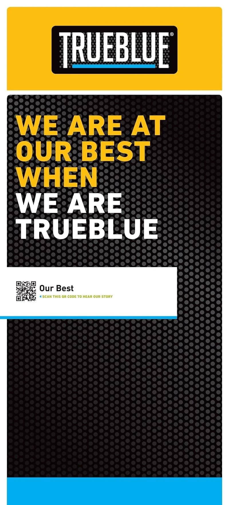
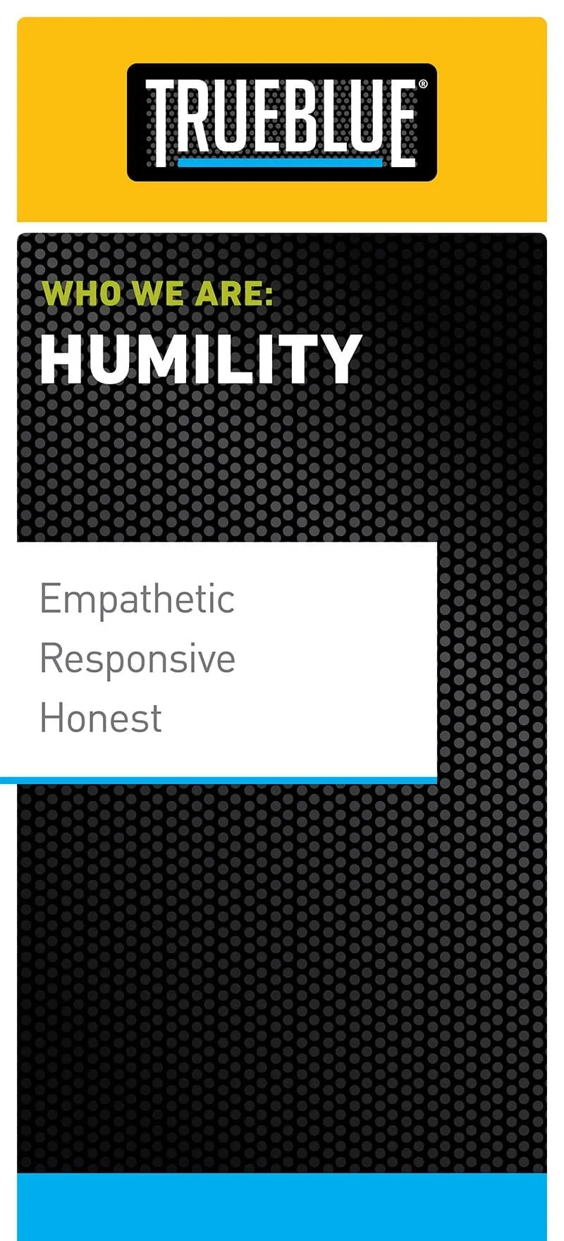
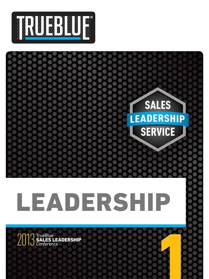
Each year TrueBlue holds a Sales Leadership Conference for their national sales teams. The theme — Stronger Together — had to get the sales forces of multiple umbrella companies working as one and cross-selling across the group.
Deliverables ran from event branding, print and email invitations to signage, display graphics, visual aids, keynote speaker graphics, way-finding, notebooks, brochures and giveaways, lanyards, and name badges. Banners, breakout room signage, and display graphics carried the identity through the venue.
Staying true
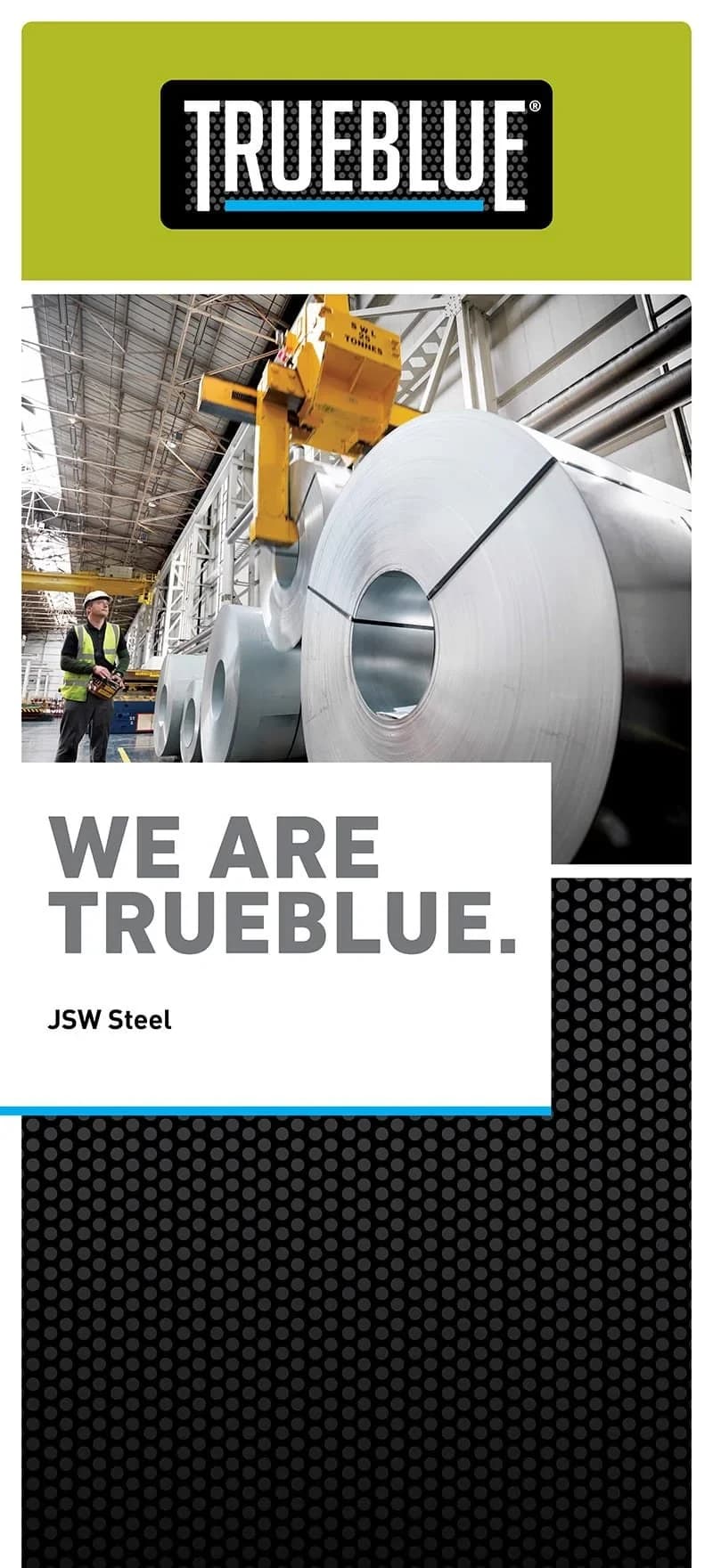
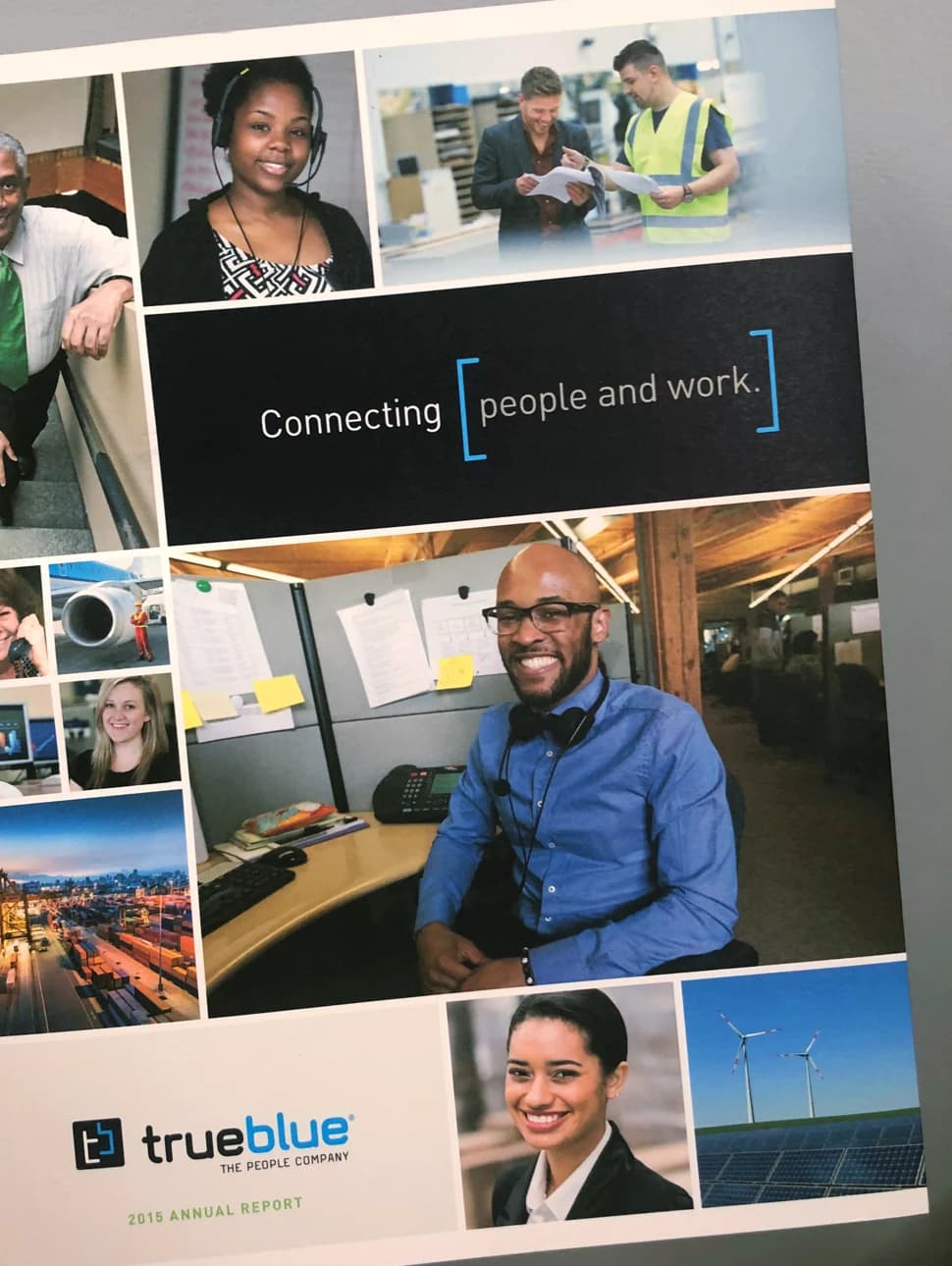
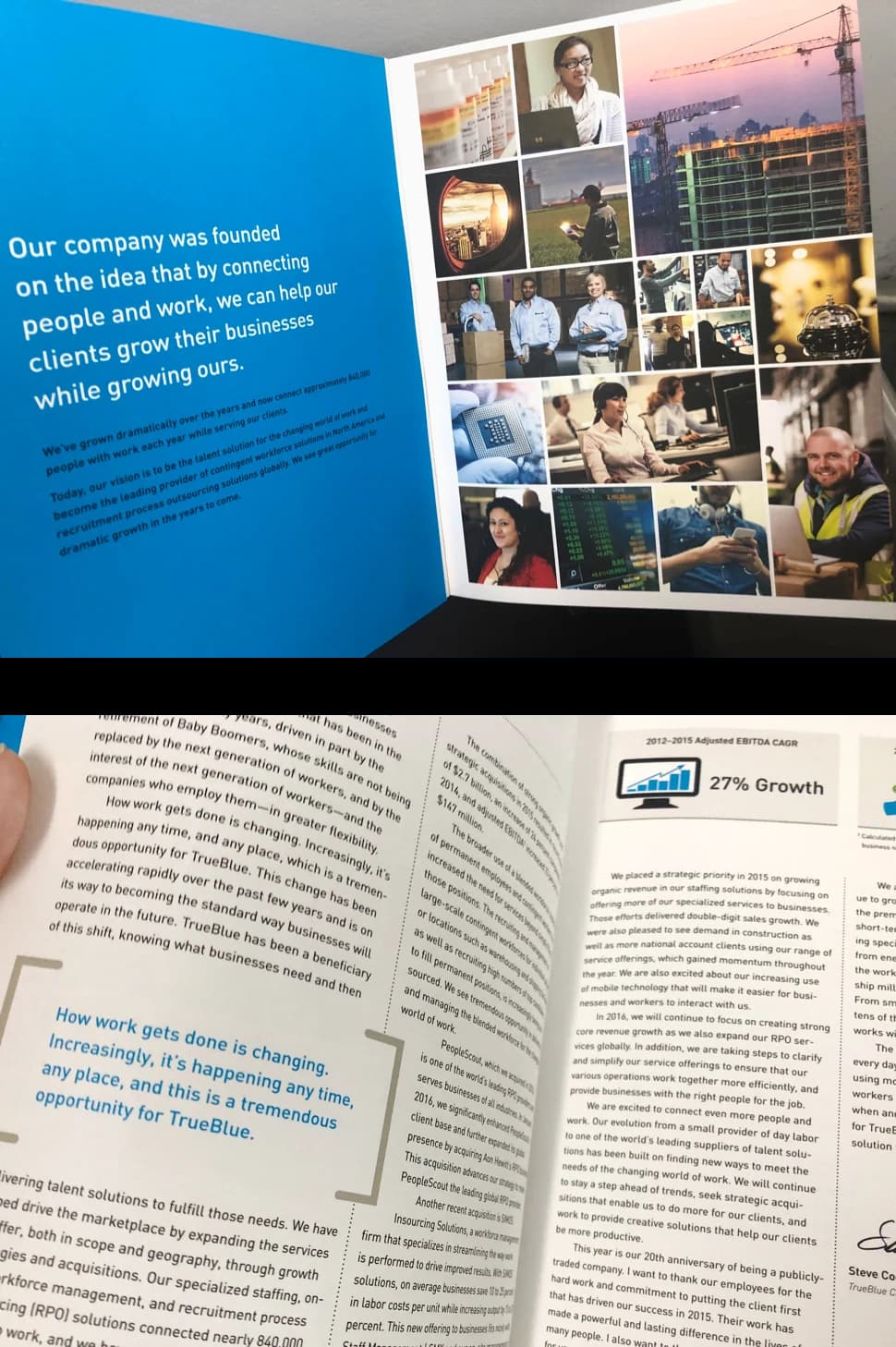
As TrueBlue evolved and acquired new business lines, the way they described their services changed. This annual report served to reestablish their core values and clarify their business model to investors.
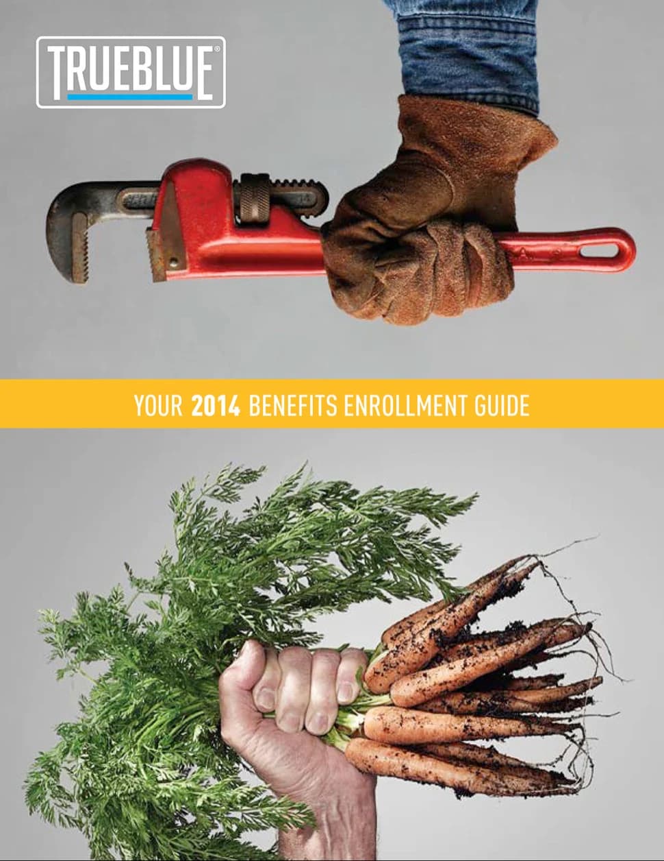
Workforce wellness
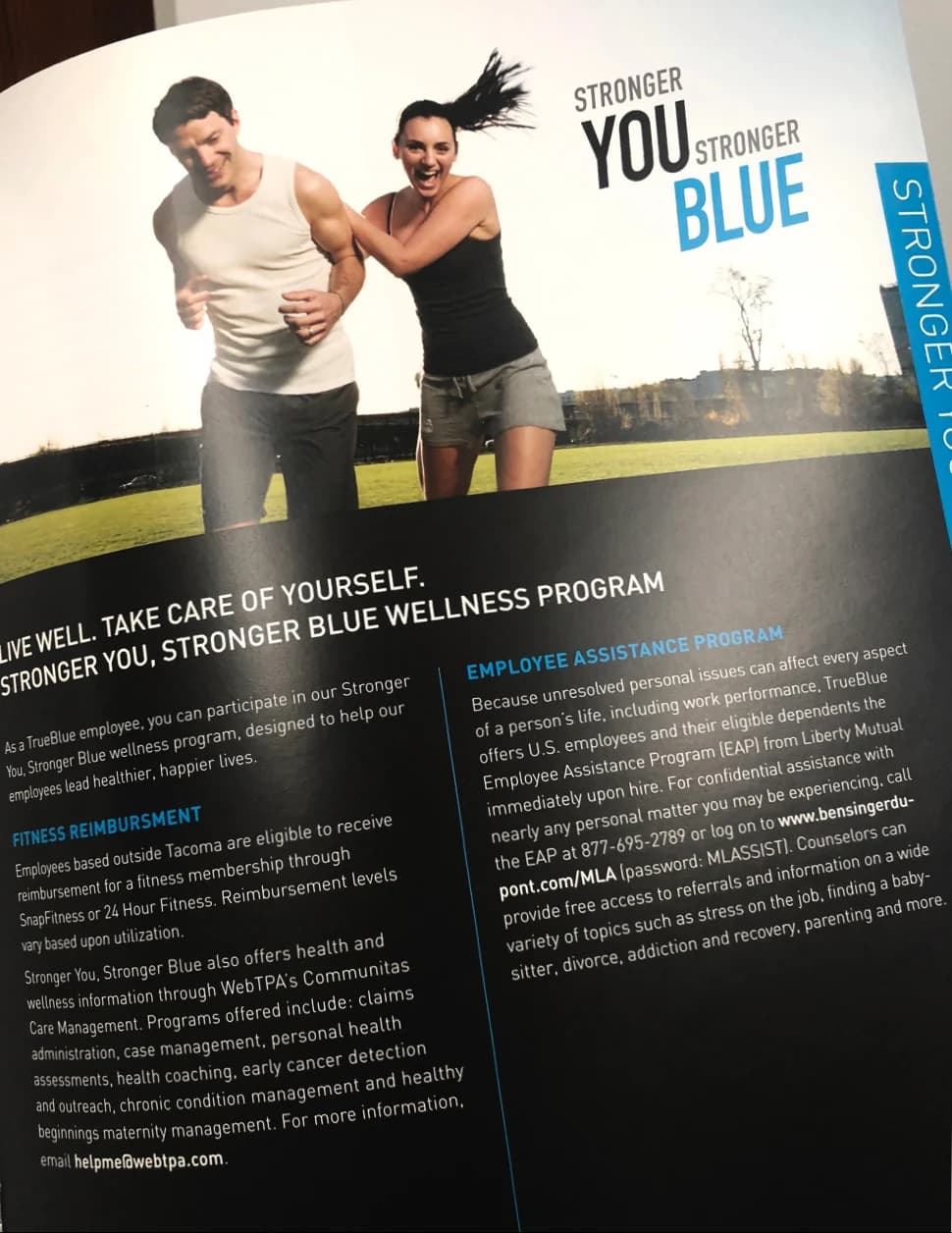
Clear, clean, and concise, with the front cover juxtaposing the iconic worker with an icon of health. This benefits guide also rolled out TrueBlue’s new wellness program, Stronger You, Stronger Blue, which we both named and created a corresponding wordmark for.