Pacific Crest Savings Bank
You’ll like what you see from the Crest
How investing in a brand overhaul bought a local Northwest bank some modern-day currency.
What I did
- Brand identity
- Voice and Style Guidelines
- Collateral
- Website
- App
- Signage
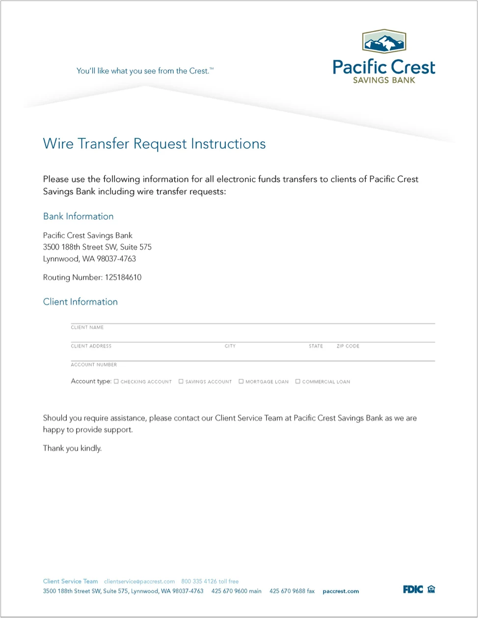
Pacific Crest Savings Bank is a local, independently owned community bank who wanted to build out their brand but first needed to bring it up to date. They wanted their logo, collateral materials, and web site modernized to reflect current best design practices and trends, and to support the new financial technologies they were embracing and offering to their clients.
Securing the elements
A new tagline — You’ll like what you see from the Crest™ — plus an earthy, Northwest color palette, expansive-feeling Northwest photography, a simplified overhaul of their mountain logo mark, and friendlier typography.
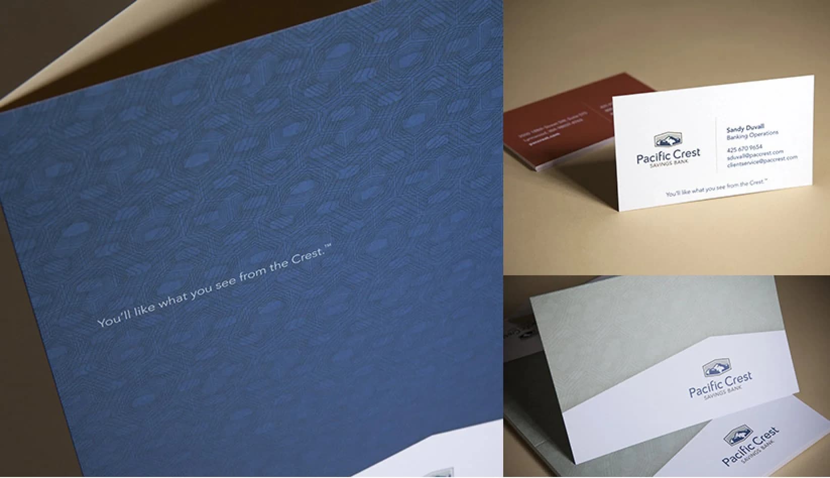
I created a full suite of templates and brand standards to guide them in their personable, helpful brand voice and visual identity system. The stationery suite includes a presentation folder which uses their signature blue with a pattern that echoes their logo shape and is reminiscent of the geometric security patterns found on currency.

Why Pacific Crest?
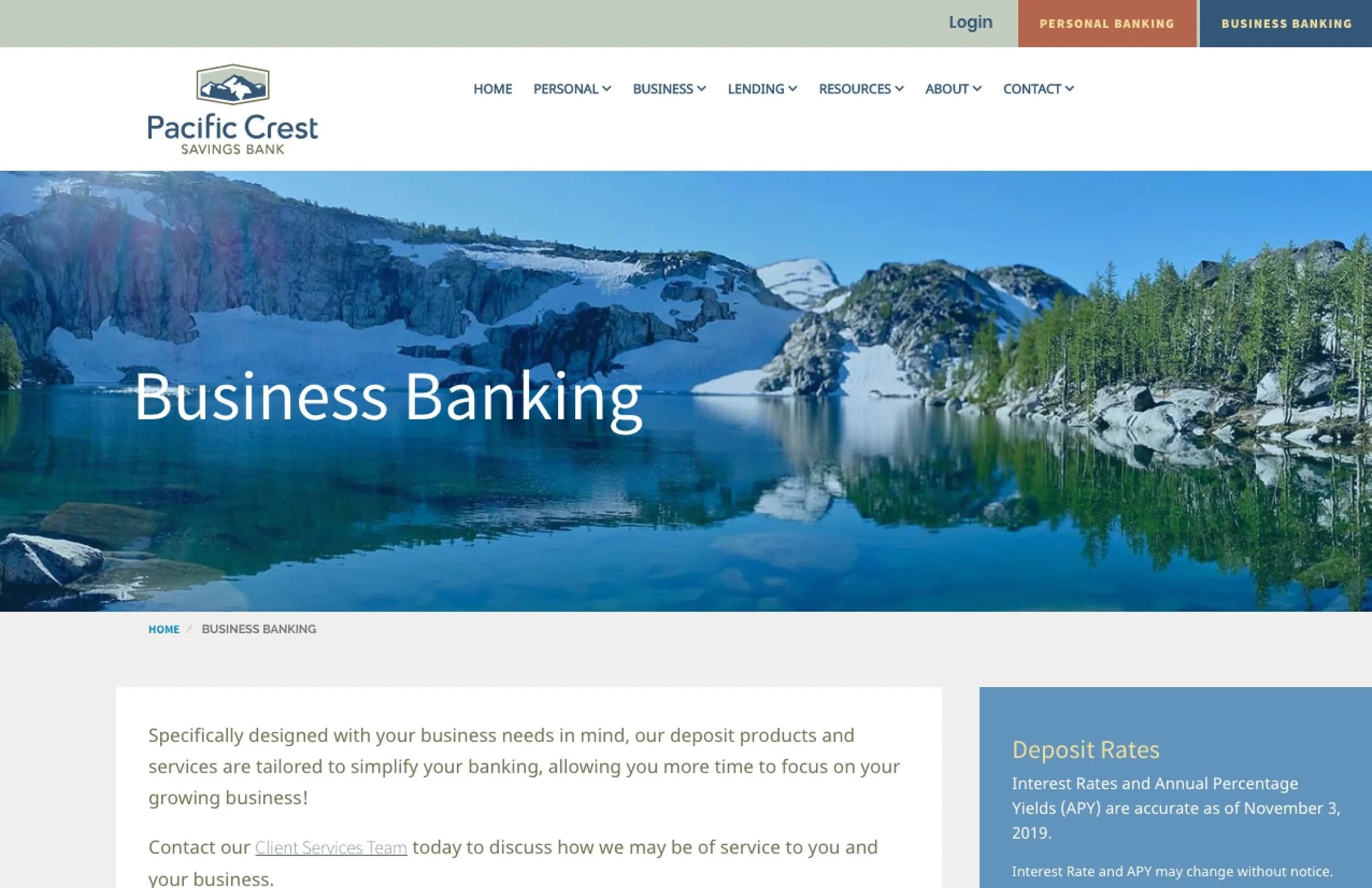
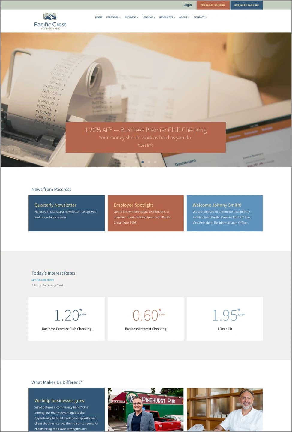
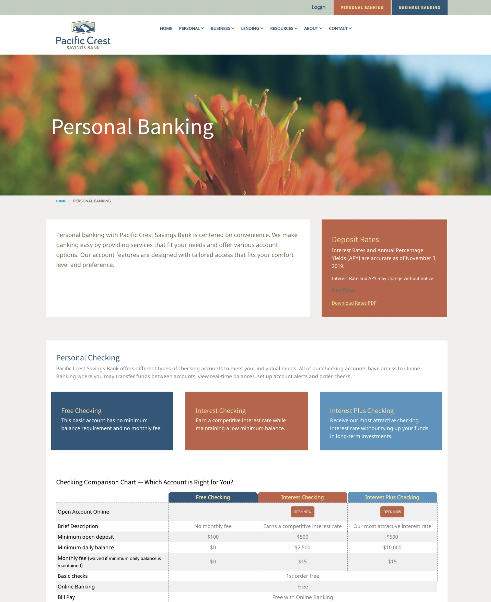
The web site was rebuilt in phases, including full-screen images of local scenery to reflect their Northwest roots, a responsive layout, employee highlights, and an easy login to mobile and business banking.
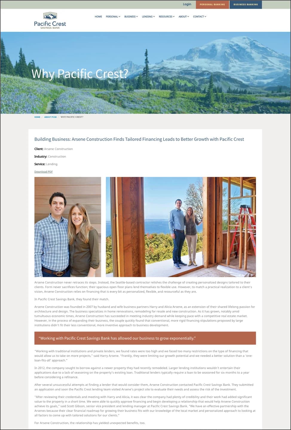
A case study section — with an in-print companion — was developed to help differentiate what makes them special: the bank’s nimble and custom vetting process, funding unique loans for projects that are often overlooked by traditional institutions.
The Crest at your fingertips
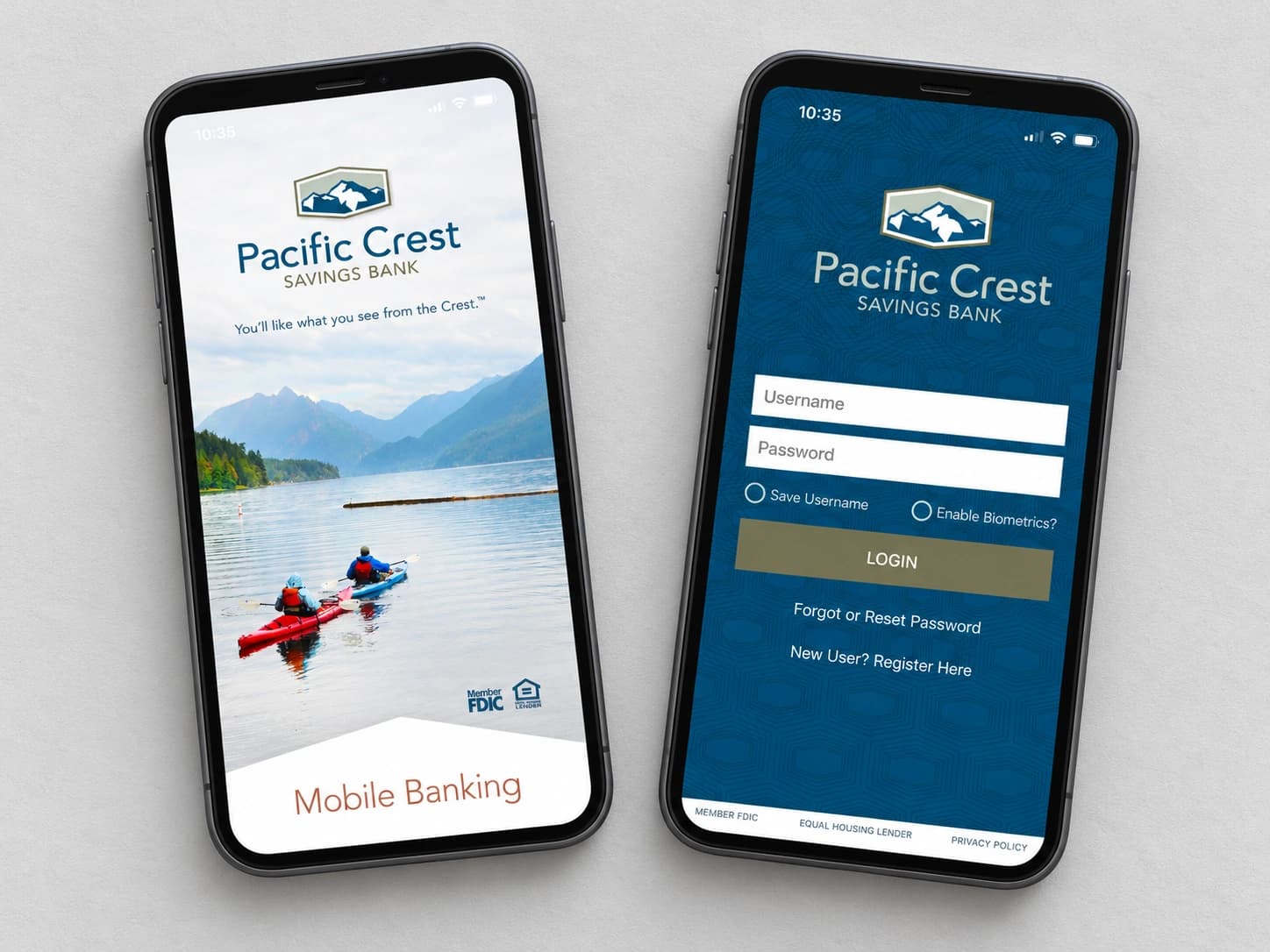
I designed app icons and worked with the client and their secure third-party banking app developer to customize the app framework, ensuring it seamlessly integrated with their suite of branded environments.

Observing the signs
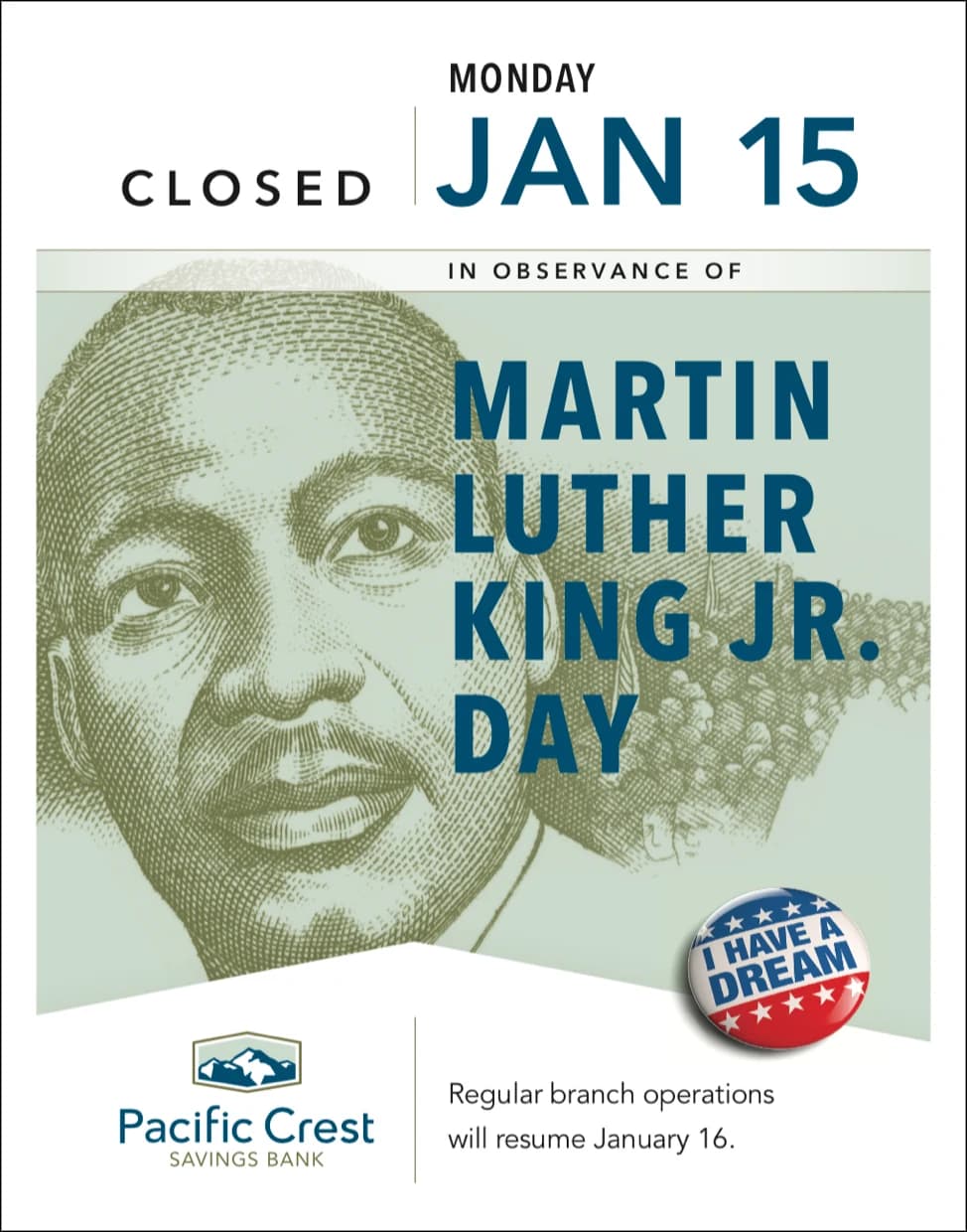
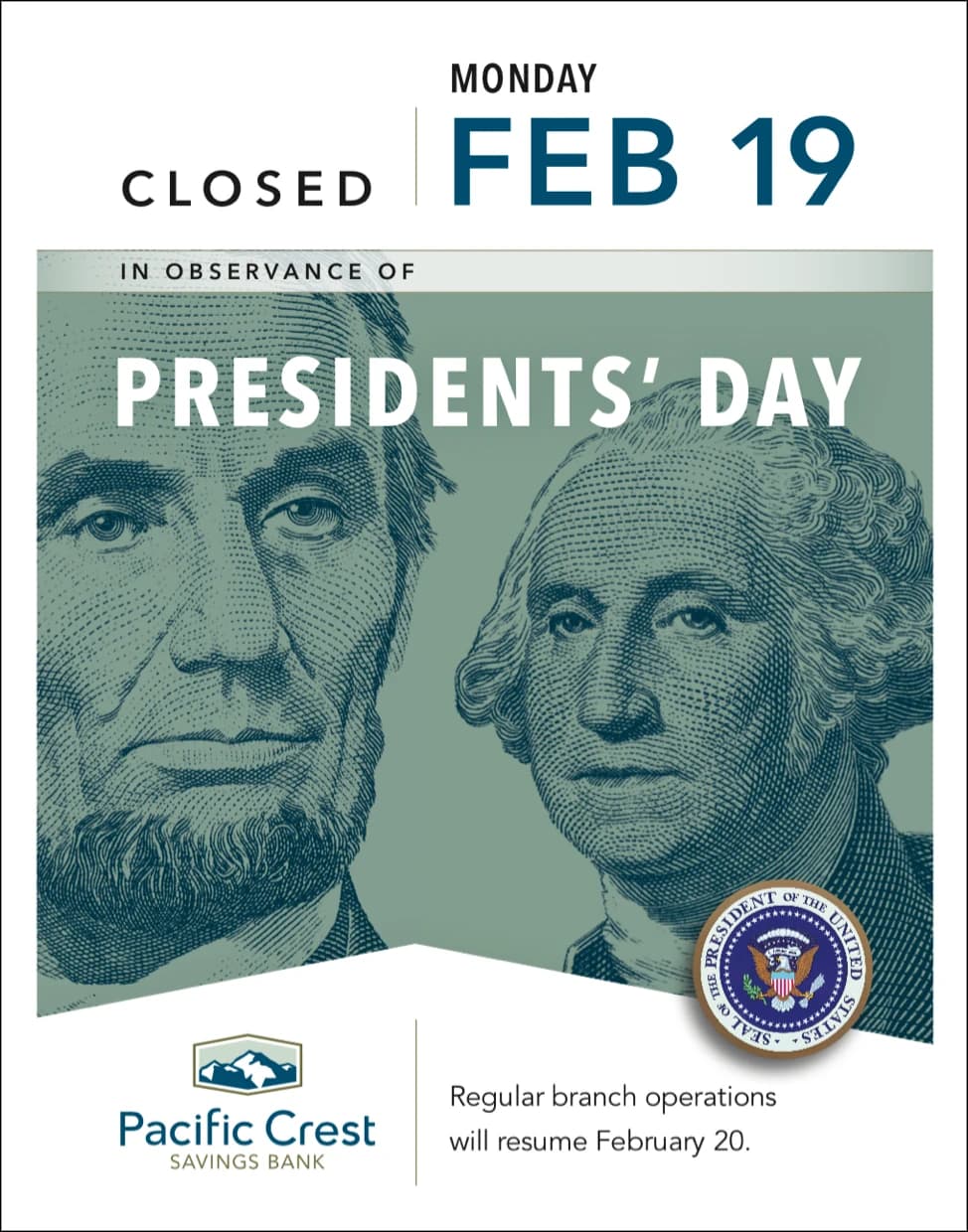
A series of holiday closure signs were produced for the entire year, incorporating a line-art illustration style often used on currency, which also families with the crest-shaped security pattern used as a background element throughout branding.